

The letterhead is not a flyer; however, it is one of the tabs available to potential customers. This feature makes the letterhead have a particular marketing capability. In appearance, the letterhead is a simple paper; But this simple sheet will contain the most important texts of an organization. Letterheads are typically used for administrative records, contract texts, proposals, and the like. To make a good letterhead, follow these simple rules.
The appropriate size for the letterhead
The first step in designing a letterhead is to choose the right size. There is no exact law in this regard; However, using standards for paper size makes the designed letterhead more functional. Letterhead paper is usually made in A4 and A5 sizes. These sizes are prevalent and widely used. As a result, you can simply design and print the letterhead on commonly available sheets. Also, if a separate envelope is not intended for the letterhead; Ready-made envelopes on the market will fit well with standard sizes.
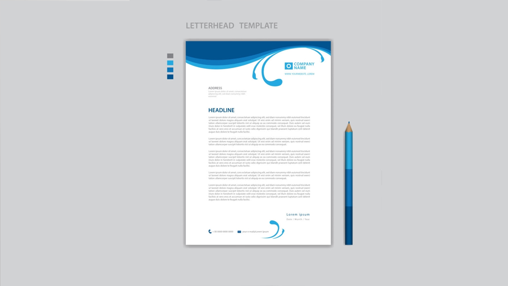
The information provided on the letterhead
After determining the size of the letterhead, the next issue is determining the information needed to print on the sheet. Information usually written at the top of the letterhead includes the company logo, company name, registration number, date, letter number and attachment. Certainly, there is no obligation to print this information at the top of the letterhead; however, the audience of official papers usually looks for this information at the top of the sheet based on their previous user experience. The company contact information is generally printed at the bottom of the page. These include addresses, telephone numbers, faxes, e-mail addresses, and website addresses.
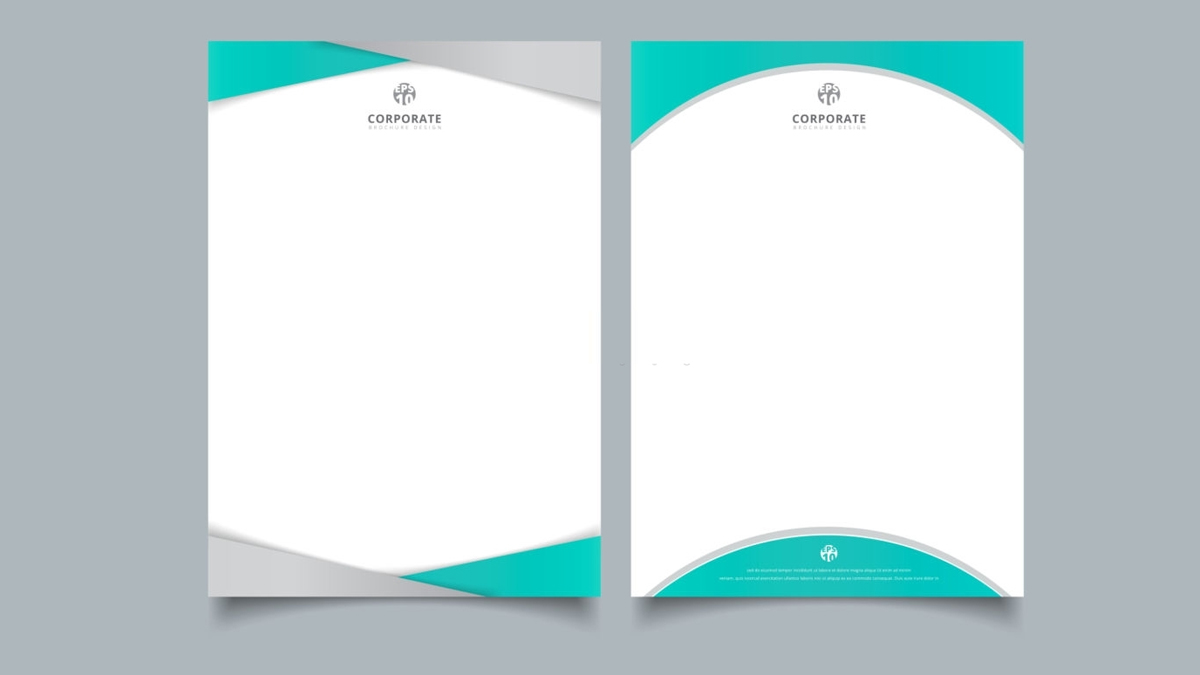
Maintaining simplicity in letterhead design
Although the role of letterhead marketing cannot be overlooked, its design should not be done with an advertising perspective. In fact, a letterhead is an effective tool for office correspondence. Therefore, it is much more important to maintain simplicity and strive to be efficient. Overcrowded headers with colorful designs create a confusing layout. In such a letterhead, the audience focuses on the margins instead of the text in the header.
Coordination with other printed products
Office sets such as letterheads, business cards, invoices and envelopes are designed in an integrated manner with the same purpose of marketing. The unified design of these components creates visual harmony between them. It is natural to use the same style for the letterhead, which has the same layout and color as other printed items; It can improve its beauty and efficiency.
Visual effects on letterhead
A particular way to increase the attractiveness of the letterhead and make a different design is to use different visual effects. For example, the designer can use the features such as designing part of a letterhead for printing in gold, letterpress, UV, and so on; Which gives a unique charm to the header.
A letterhead with notable background
When designing a branded letterhead, the margins are significant; The middle space for writing texts usually remains empty; However, some people are interested in leaving a mark of their brand in the background. In such a case, designing a unique watermark of the company logo or typography of the company name would be an excellent idea.